In both the QC Report and Variable Analysis Graphs data can be analyzed for QC or SPC Flags. In a classic SPC Chart we are trying to detect variation beyond the normal chance variation of the process. These variations are called Special Causes.
The main purpose of a SPC Chart is to detect a Special Cause (i.e. a process that may not be in control). SPC charts allow you to detect potential problems before they become obvious. Once a special cause is identified, we can then take actions to remove it.
The following rules are generally accepted in interpreting SPC/QC Charts.
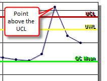
All points above or below the Upper and Lower Control Limit:
Checks each value against the Upper and Lower Control Limit.

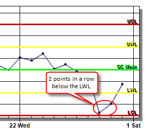
??? Consecutive points are above or below the Warning Limits:
Default 2. If 2 or more consecutive points are above or below the Warning Limit the data is flagged.

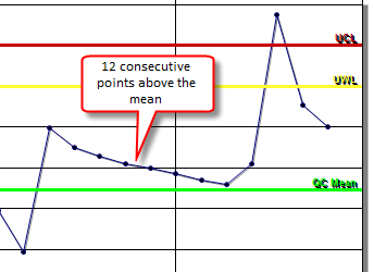
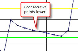
??? Consecutive points are on one side of the mean:
Default 7. If 7 or more consecutive points fall on the same side of the QC Mean. QC Mean is the average of the data set if calculated or can be manually entered as a setpoint.

??? Consecutive points are sloping in one direction:
Default 5. If 5 or more consecutive points are sloping in the same direction (i.e. values of 1,3,4,7,9 are sloping up for 5 points since each point is greater than the previous point).
