|
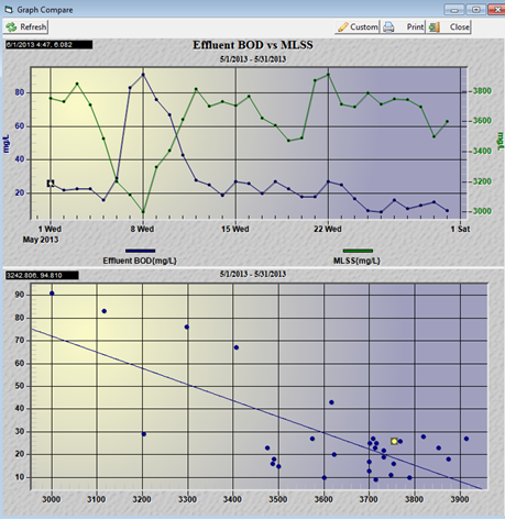
A two variable trend graph and a scatter graph (Compare graphs) are a pair of charts to determine if there is a statistical correlation between two parameters. |
 |
To produce a compare graph set for Effluent BOD:
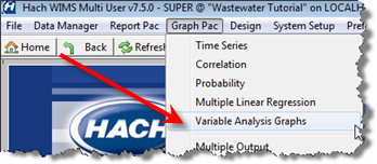
1. Go to Graph Pac, Variable Analysis Graphs.
2. Choose your variable and date range. Effluent BOD and May 2014:
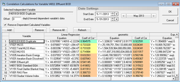
3. Click the  button. This will display the Correlation Calculations for Effluent BOD:

This form shows what variables correlate to the Variable to Analyze. It provides four different line/curve fits to the data and calculates the Coefficient of Correlation (Coeff of Cor) for each. The correlation coefficients of correlation are a measurement of the goodness of fit. The higher the Coefficient, the better the fit (1.0 being a perfect fit). The list is sorted by the Linear Regression Coefficient of Correlation.
In this example, we find that the Eff BOD Duplicate correlates to Eff BOD the best. However, while this makes perfect sense statistically, this give us no insight into what affects our Eff BOD. However, MLSS is second on the list and something we can control.
4. Click on the MLSS row, the Selected Independent Variable will be updated and click OK.

5. Click 

What we see is an inverse relationship between MLSS and Eff BOD. As the MLSS goes up, the Eff BOD goes down. Using the scatter graph we can look at the line drawn thru the points and use it to predict the Eff BOD based on MLSS.
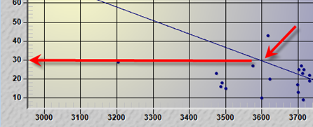
What is the predicted Eff BOD at a MLSS of 3600? Look where the line cross 3600 and look at the Y-Axis value. The answer is approximately 30.
