|
Creates a bar graph with up to 60 groups and 20 variables per group.
Note: Saved Bar graphs can be placed on a Spread Report using the GraphBar spread function. |
 |
Example 1. Create a bar graph displaying monthly averages for a single parameter (Free Chlorine) at different locations.
1. Click Choose Vars and the variable browser will be displayed. I choose all my Free Chlorine Residual variables in Distribution (up to 20 variables)

2. You will be prompted to choose what the Point Labels will be. In this case, since everything is Free Chlorine Residual I want my point labels to be the Locations so I pick Location.
3. I want to display 2 groups, 1 for this month and 1 for next month. Change Grouping to Month. Click on next row (row 3) and press F3 to ditto. Change the offset for the new row to 2 to get the 2nd month:

4. Each group is labeled Free Chlorine Residual. To display the Date of the grouping set the grouping to SD("Date Format") - SD("mmm yy")
5. Graph will be displayed as shown:

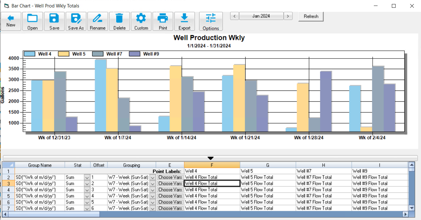
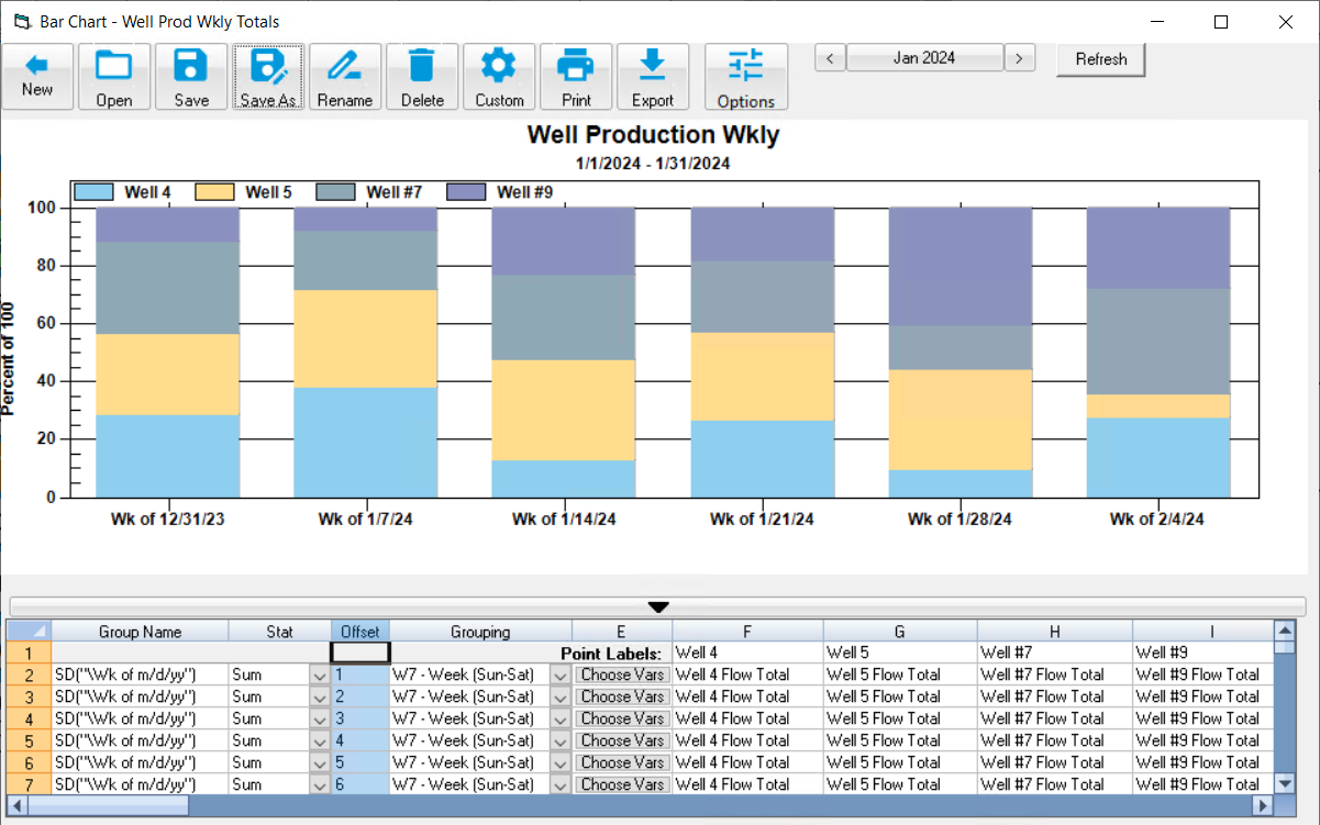
Example 2. Create a stacked bar graph displaying Well Production as a percent of total production from Wells by week.
1. Click Choose Vars and pick your Well Flow total vars.
2. You will be prompted to choose what the Point Labels will be. In this case, since everything is Well Flow Total I want my point labels to be the Locations so I pick Location.
3. I want to show weekly totals. Set Stat to Sum, Grouping to W7 - Week (Sun-Sat), and the Group Name to SD("\Wk of m/d/yy"). Note: The "\" before the W instructs the format to display the character W instead of the Week number for the date.
4. Click on line three, right click and choose Ditto (or use F3 key) to duplicate the line above. Notice Offset is set to 2. Ditto thru line 7 to show six weeks of totals. Press refresh to display the graph:
5. To see as a Stacked Bar as percent, click Custom, go to Plot tab and choose Bar stacked, Percent
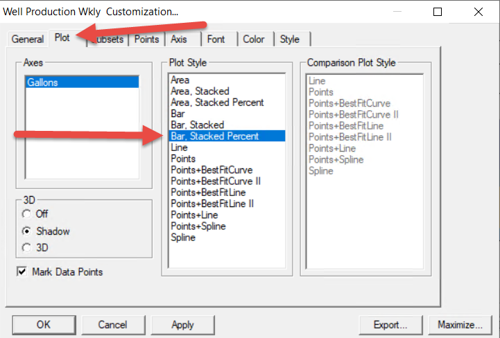
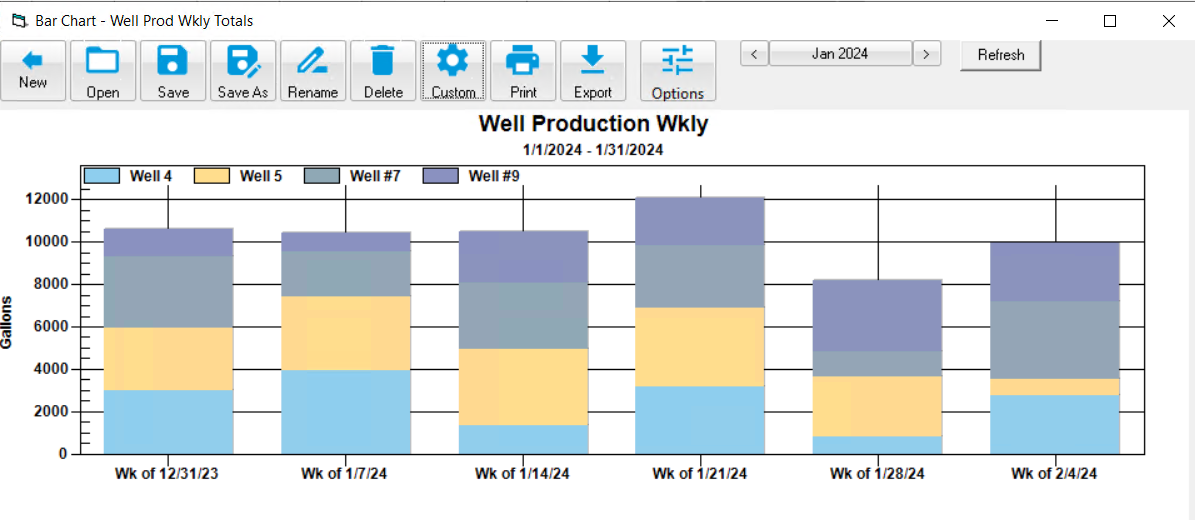
6. To see as a stacked bar, click on custom, Plot, and choose Bar, Stacked:
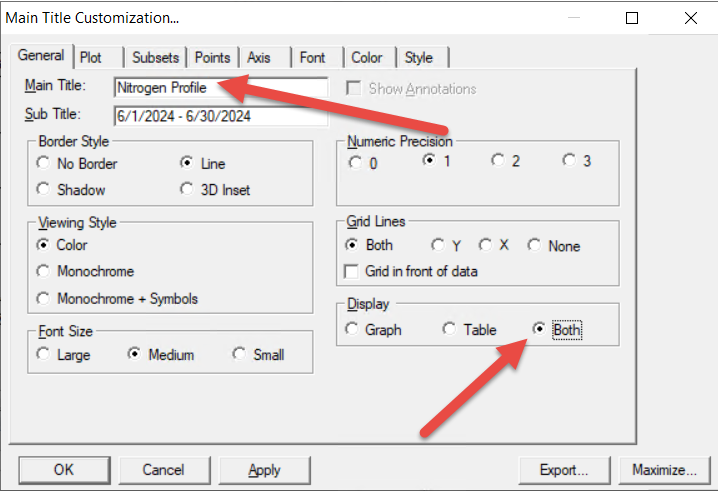
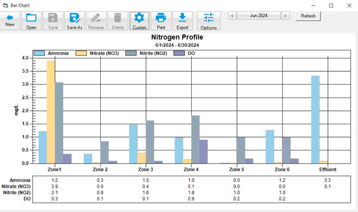
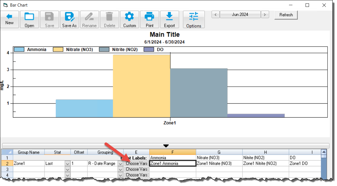
Example 3: Show the most recent values for my 15 minute Nitrogen variables of the Zones of the BNR.
1. Choose Zone 1 vars Ammonia, Nitrate, Nitrite and DO. Set Point Labels to variable name. Choose stat of Last:
2. Choose vars for Zone 2 thru 6. Add vars for Effluent. Set Stat to Last:
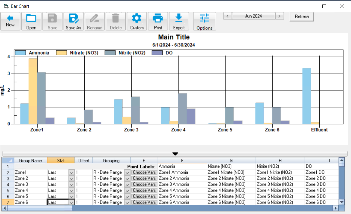
3. Click Customize, Set title and choose to Display Graph and Table: